How to Coordinate Kitchen Finishes with Vadara Quartz Countertops
In just a few years, engineered quartz has become the most popular countertop material in the United States, besting natural stone, wood, solid surface, tile, and laminate for a place of honor in the kitchen. It’s no surprise, given the material’s timeless good looks and durable, low-maintenance finish. But how do you pair it with other colors, patterns, and finishes?
Here are some basic ground rules to help keep things harmonious:
Star Power
Designing a kitchen is like staging a play: You need to figure out who’s the star and who is playing a supporting role. As you select materials, decide whether you want the cabinets, countertops, backsplash, walls, or appliances to be the center of attention. Once you’ve determined that, choose a finish that makes your star stand out, and choose more demure surfaces for the secondary elements.
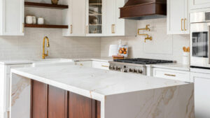
Pairing Counters and Cabinets
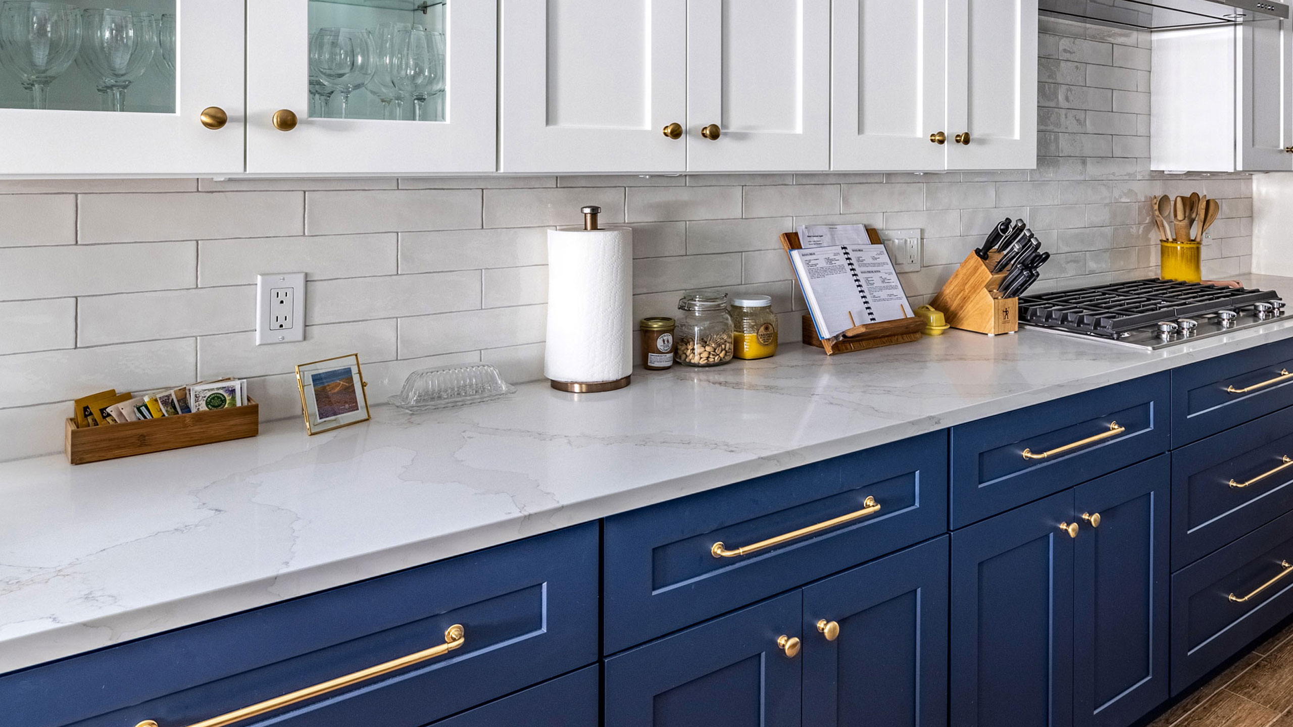
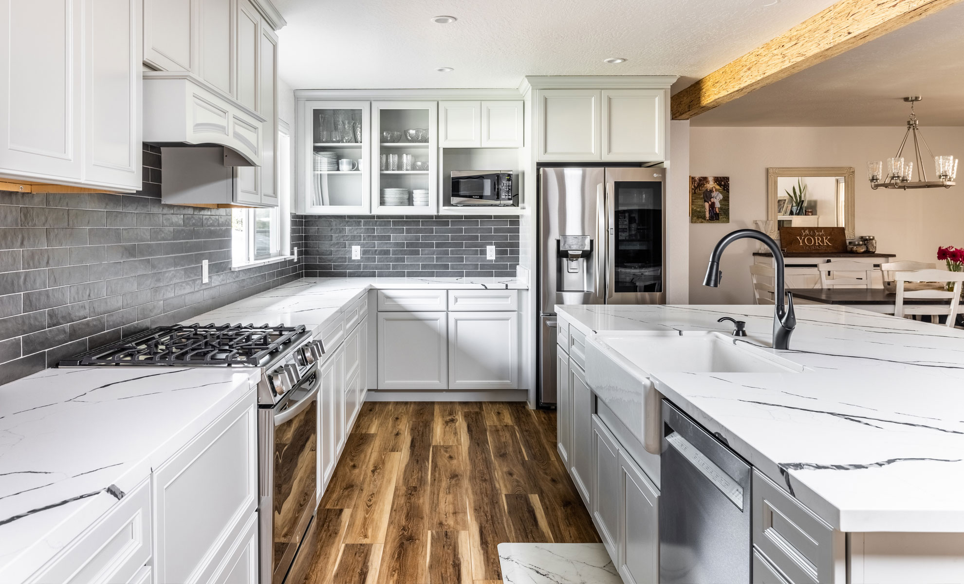
Vadara patterns, by design, work with a multitude of cabinet styles. But if you choose quartz with pronounced veining, like Nakoda or Nordic Storm, it’s best to pair it with flush or simple Shaker-style cabinets so the two aren’t competing for the spotlight. Conversely, if your cabinets are more ornamental (with elaborate carving, figured wood, or a decorative finish), stick with a more subdued countertop like Sereno Bianco or Solano Bella.
When pairing Vadara with painted cabinets, make sure the colors are compatible. A simple way of doing that is by drawing the cabinet color from colors found in the veining or accent pieces embedded in the quartz. (This is a clever trick to use when picking a backsplash or wall color too.) Repeating those colors on an adjacent surface will make the counters pop and give the kitchen a more coordinated look without being too matchy-matchy.
You might think pairing white cabinets with white counters is a no-brainer but avoid combining warm (yellow) whites with cool (blue whites). Not sure which category your quartz falls into? The Vadara website makes it easy for you, with labels that tell you whether a pattern is cool-toned, warm, or in-between.
If the base cabinets have a natural wood finish, your best bet is white or black quartz. It’s perfectly okay to pair dark wood cabinets with dark counters and light wood cabinets with light counters — but consider introducing a contrasting wall paint or backsplash to keep things from looking too monochromatic.
It’s common today to use contrasting cabinetry on an island or even on a portion of wall cabinets. Just be sure those finishes are compatible with your countertop selection as well.
Pairing Counters and Backsplashes
Once you’ve chosen your cabinets and countertops, it’s time to select a backsplash. Perhaps you could consider extending the quartz up the wall for a sleek and seamless look. Or introduce a different material, texture, pattern, or sheen on the backsplash for more variety and to add visual interest. Once again, it’s best to marry warm countertop colors with warm backsplash colors and cool countertop colors with cool backsplash colors.
A tile backsplash with a pronounced pattern works best with a countertop containing less boldly defined features. That way, the two surfaces aren’t competing for the spotlight. (Consider applying a grout color that coordinates with the countertop to help tie the two together.) Black quartz counters absorb light, so try to offset them with a reflective backsplash, like glazed or glass tile or stainless steel.
Pairing Counters and Walls
It’s a good idea to select your counters before choosing your wall finish since quartz comes in a finite selection of colors – while paint and wallpaper are available in nearly any hue imaginable. Don’t make any decisions based on a tiny swatch; wallpaper dealers will loan out sample books, and you can either buy a large swatch from a paint dealer or take home a test jar and do a brush-out right on the walls. (While you’re at it, paint the opposing walls in a corner to see what the color looks like when it’s reflected on itself.) If you’re skittish about testing colors directly on the wall, paint a poster board instead and move it around the room.
If you want to use bold colors in the kitchen, do it with paint, wallpaper, or accessories, and choose a neutral shade for high-ticket items like cabinets and counters. That way, if you ever tire of the color or want to sell your home, it will be reasonably inexpensive to fix.
A Final Word of Advice
Just as you’d never open a play without a rehearsal, don’t order finishes until you’ve seen how they perform together in your kitchen. Ask to borrow samples, then view them under your kitchen’s natural and room light at various times of the day. Seeing a wallpaper or cabinet in your home can be a very different experience from seeing it in a showroom. Take the time to assemble a palette of samples ahead of time, to minimize surprises later. Vadara has resources, product samples, and advice to make your home truly yours.